My UX/UI Design Process
Summary
Mission
Communicate my design process utilizing the 4 phases of Design Thinking—Discovery, Definition, Design, Delivery.
Phase 1:
Discovery
Objective
Fully explore the problem space.
Make sure I fully understand the stakeholders product vision, how they measure ‘success’, technical constraints, and what problems we are solving for the user. In this phase, it is important to understand what research and data is available to inform decision making.
My Process
White board sketches. Logic Flows. Anything that helps understand the problem space. It is important that the teams leaves this phase with common understanding and agreement.
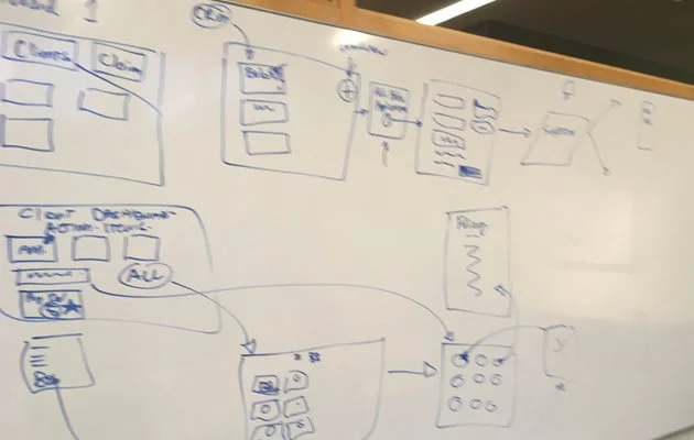
M Financial Group — Working session
The project started with a working session I led with internal subject matter experts to capture their life insurance underwriting logic and flow.
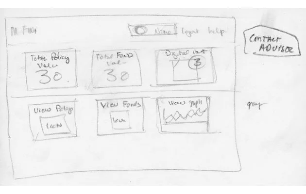
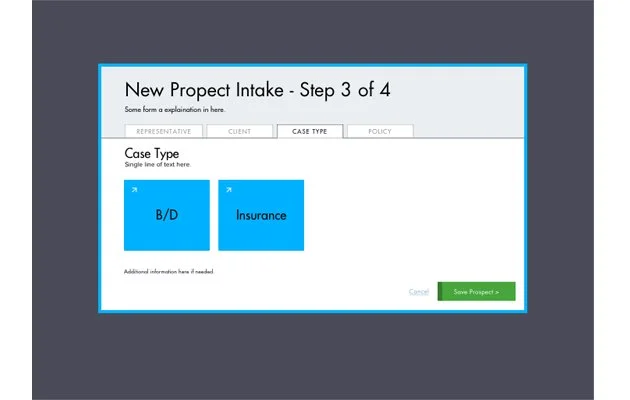
M Financial Group — Screens sketches
At the end of the working session, I translated the whiteboard sketches into rough screens with additional details to capitalize on the output of the working session.
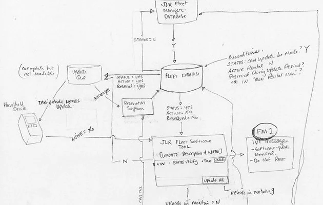
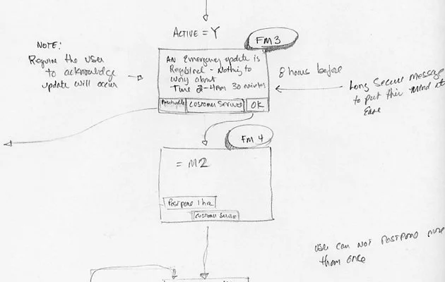
JLR Fleet Manager — Logic sketches
I created the logic based on the design brief, competitive analysis, and by applying use cases I created in collaboration with the internal stakeholder.
JLR Fleet Manager — White board sketches
Collaborating with another designer, I sketched out some very rough screens to facilitate a common understanding between us.
Phase 2:
Definition
Objective
Synthesize Phase 1 by creating rough wireframes and interactions models to identify themes. The refinement in this phase should help uncover additional unanswered questions of pain points.
My Process
In order to make sure the user needs and their job-to-be-done is fully align with the product vision, Phase 2 focuses upon creating lo or mid-fidelity wireframes with enough detail so the engineering team can provide a accurate estimation of effort and the product team can create a roadmap.
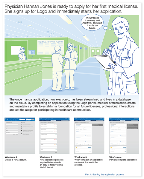
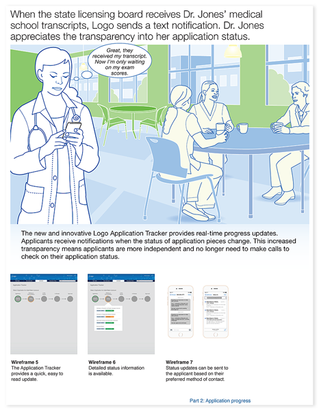
Storyboarding
Connecting the user, a narrative flow, and mid-fidelity screen comps helps communicate and idea and build empathy for the user, their needs, and their job-to-be-done
JLR Connected Services — Common elements
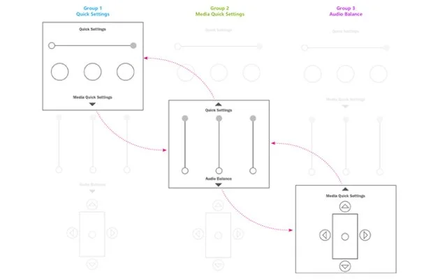
Quick explorations of content-to-screen proportions, colors were used to designate specific areas or components (left).
Communicating the number of choices the user would face—it’s too complex (right).
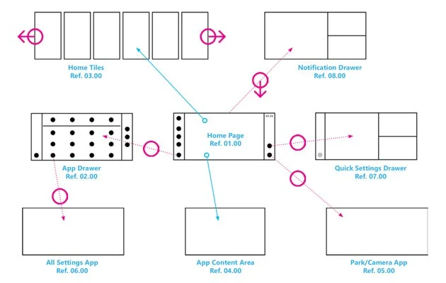
JLR Connected Services — Common elements
These wireframes are part of series created to propose both functionality and interaction. The interactions were inspired from mobile UI/UX patterns with the intent of bringing familiar interactive patterns into the vehicle. Simple wireframes such as this were helpful to conveying the concept.
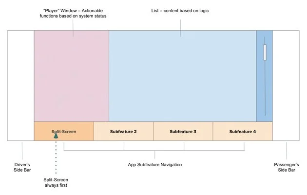
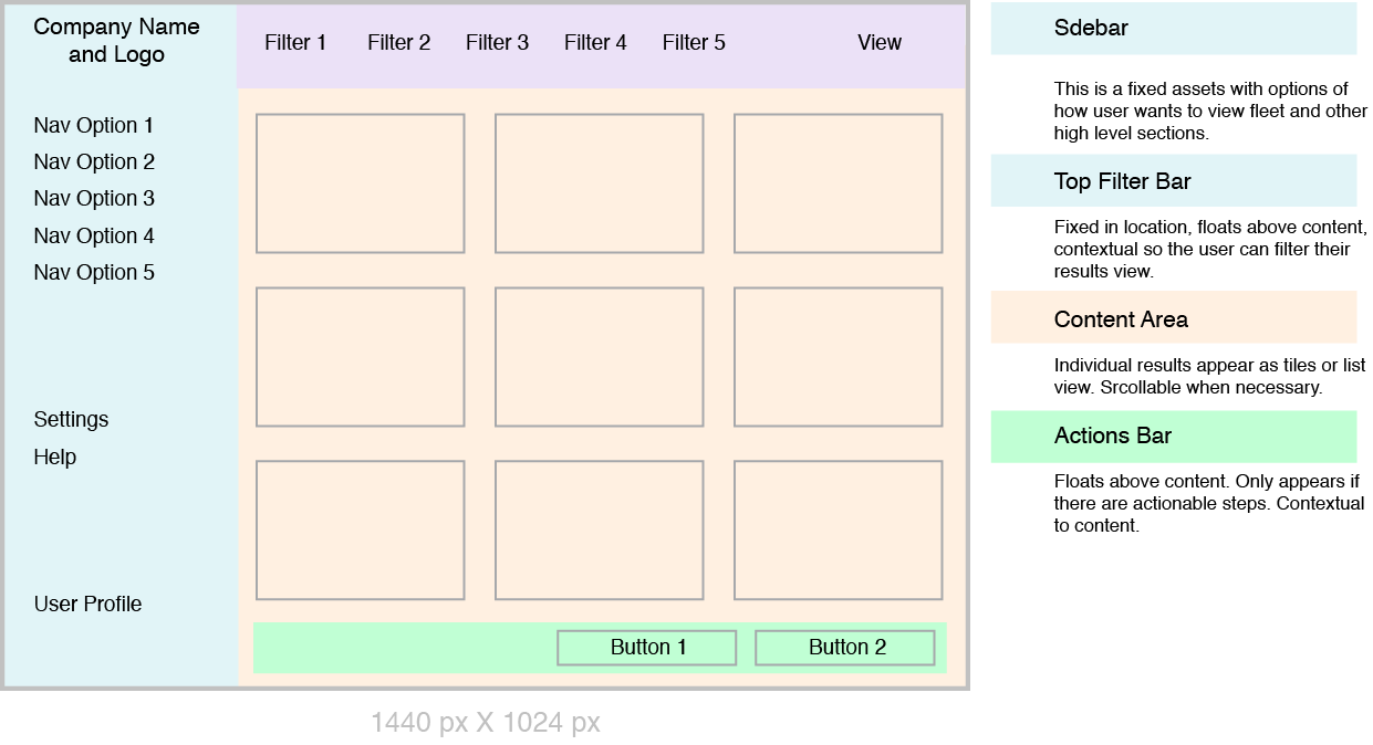
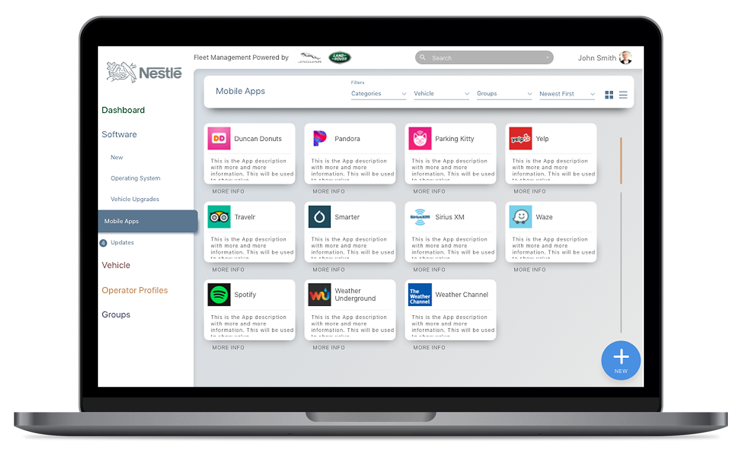
JLR Fleet Manager — Lo-Fi wireframes
This diagrams was created to communicate overall structural proportions and layout, functionality, and content to the internal stakeholder.
Phase 3:
Design
Objective
Create high fidelity screens including all edge cases. In corporate the brand elements and expand the component library if necessary. Functional prototypes are created at this time.
My Process
Utilize brand elements and component libraries to be the wireframes to life.
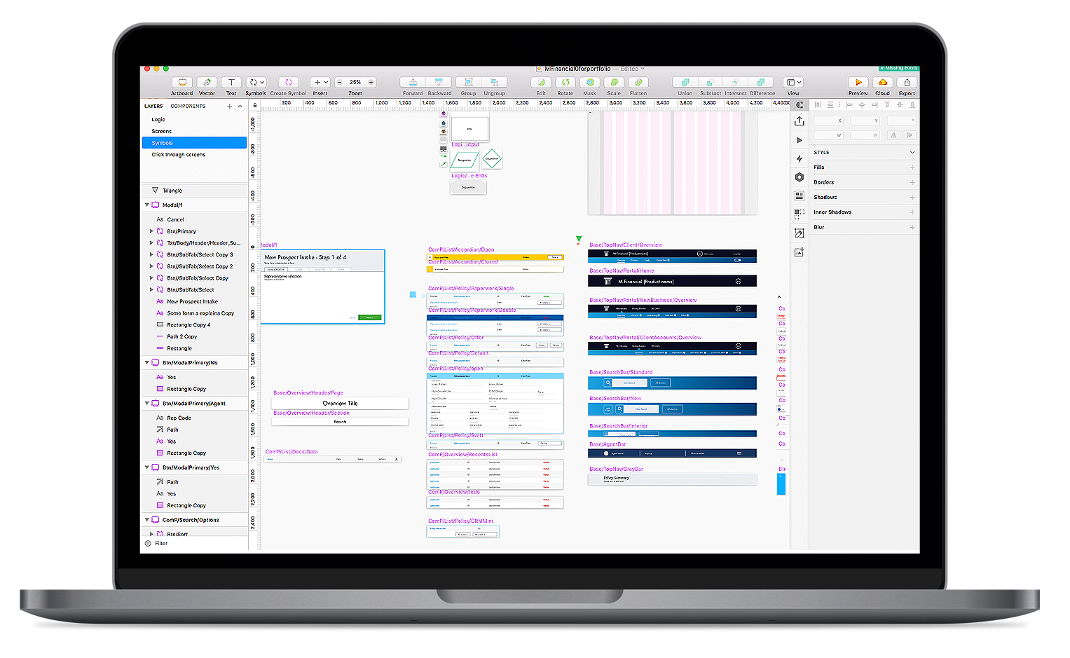
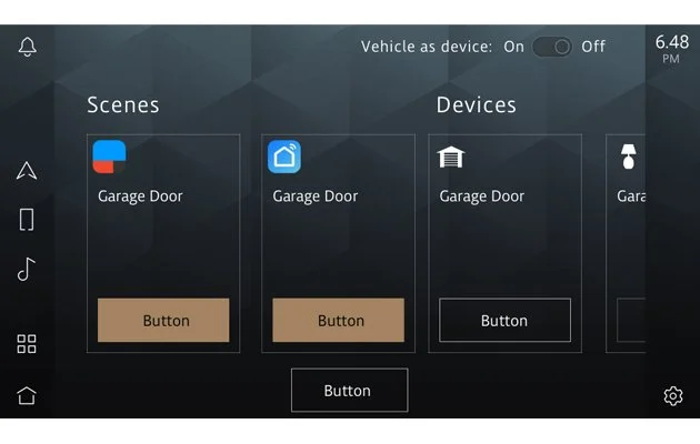
JLR — Creating a Figma component library
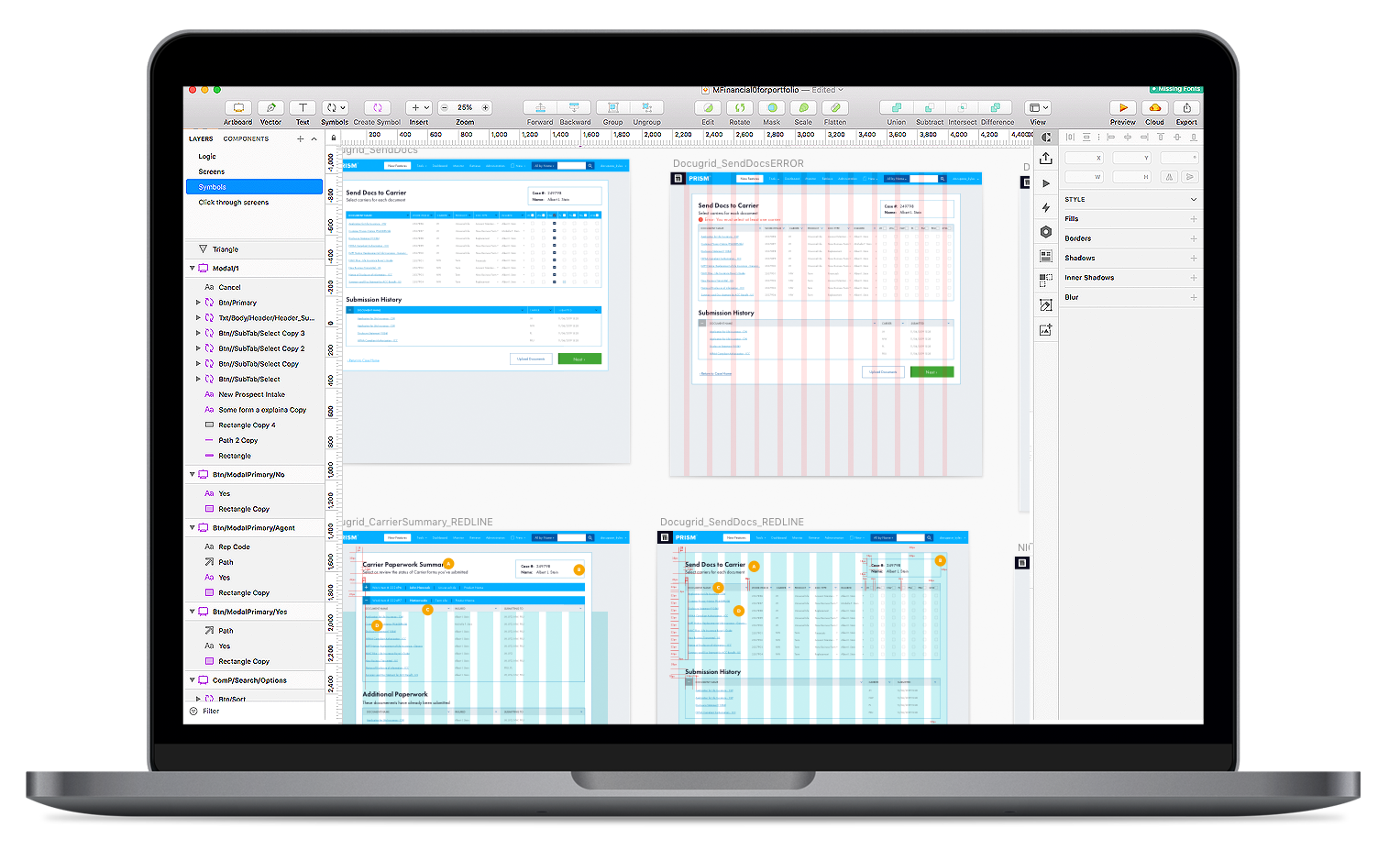
M Financial Group — Aligning new functionality to brand guidelines
JLR — Component library allows for quick hi-fi screen creation
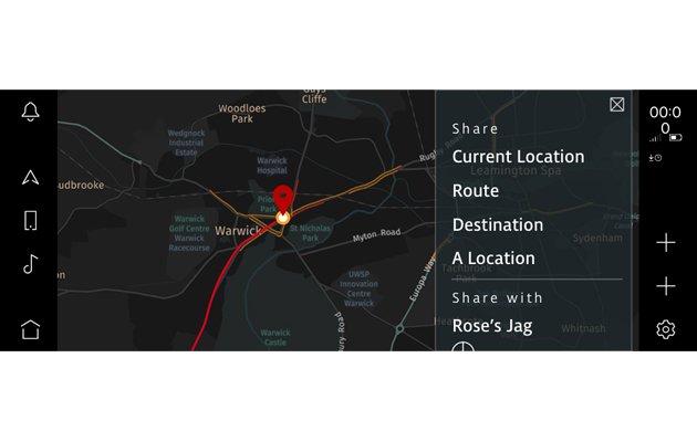
JLR — Creating new UI components for new web app
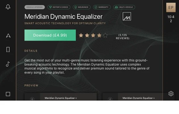
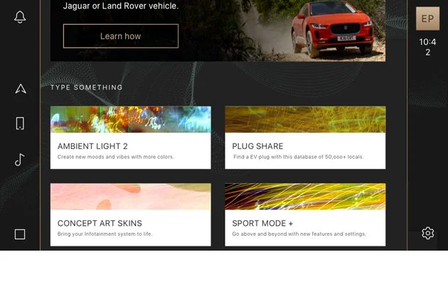
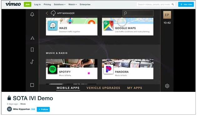
JLR SOTA
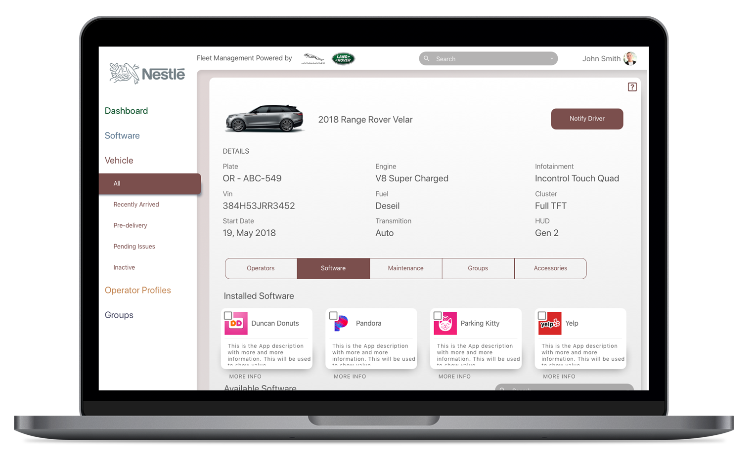
The visual design of this projects includes numerous new components. Foremost is the large product name and CTA, both significant additions that reflected outstanding hierarchical issues raised in user testing. Abstract imagery was used to create emotion and excitement for new features.
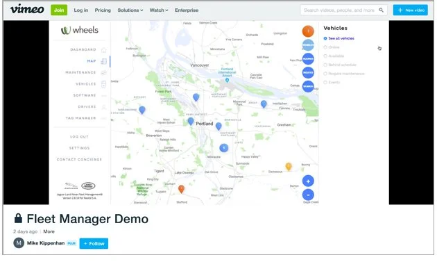
JLR Fleet Manager
A Proto.io prototype was created for the team to test new interactions and component behaviors, then communicate them to internal stakeholder.
JLR SOTA
The number of new components in this featured made it especially important that the prototype captured their behavior in as realistic manner as possible.
Phase 4:
Delivery
Objective
Perform usability testing and insight analysis to ultimately start delivering functional specs to the development teams.
My Process
Work with the product team to identify and determine what insights they would like to gain from usability testing. Make functional specifications aligning to the needs of the development teams.
VW.AC Working Prototype
JLR —Fuel Payment Spec Sheet 01
JLR —Fuel Payment Spec Sheet 02

